The Tesla logo, with its sleek and minimalist “T,” is one of the most recognizable symbols in the automotive world. While it might appear as a simple nod to the brand’s name, its design carries a deeper, more technical significance that many are only now starting to notice.
A Symbol Rooted in Engineering
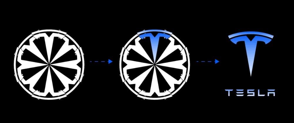
The “T” in Tesla’s logo is more than just a stylized letter; it represents a cross-section of an electric motor. Specifically, the vertical line depicts one of the rotor’s poles, while the curved arc above it symbolizes a part of the stator. This design choice pays homage to Nikola Tesla, the inventor of the alternating current (AC) motor, and underscores the company’s commitment to electric propulsion technology.
Elon Musk confirmed this interpretation in a tweet, stating, “Similar to SpaceX, the T is like a cross section of an electric motor, just as the X is like a rocket trajectory.”
Evolution of the Logo
Initially, Tesla’s logo featured the “T” within a shield-like emblem, conveying a sense of protection and safety. However, in 2017, the company opted for a more streamlined look, removing the shield to focus solely on the stylized “T.” This change reflected Tesla’s evolution and growth in the electric vehicle industry, emphasizing innovation and modernity.
Design Philosophy and Brand Identity
The Tesla logo exemplifies the company’s design philosophy: merging functionality with form. By embedding a reference to the electric motor into its visual identity, Tesla communicates its technological foundation and forward-thinking vision. This approach aligns with the brand’s emphasis on innovation, sustainability, and cutting-edge engineering.
Moreover, the logo’s simplicity and elegance resonate with Tesla’s product design, reinforcing the brand’s image as a leader in the electric vehicle market.
Public Perception and Interpretations
Over time, various interpretations of the Tesla logo have emerged. Some have likened it to a cat’s nose, a power line fragment, or even a Serbian axe. These diverse perspectives highlight the logo’s abstract nature and its ability to engage the public’s imagination.
However, understanding the logo’s true inspiration—a cross-section of an electric motor—adds depth to its meaning and showcases Tesla’s dedication to its technological roots.
Conclusion
The Tesla “T” logo is a masterful blend of design and engineering, symbolizing the company’s commitment to electric propulsion and innovation. By incorporating a visual representation of an electric motor into its emblem, Tesla not only honors its namesake, Nikola Tesla, but also communicates its core values and mission.
As the company continues to push the boundaries of technology and sustainability, its logo serves as a constant reminder of the intricate engineering and visionary thinking that drive Tesla forward.